
The historical electricity risk curve report has been enhanced to provide a comparison of hydro storage (updated daily) against the full set of risk curves, boundaries, and triggers first established by the system operator in 2019.
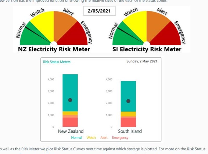
The following curves are now available via the show parameter:
- Risk status curves (default)
- Percentage risk curves
- Contingent storage release boundaries
- Official conservation campaign triggers
- All curves, boundaries, and triggers (enabling a comparison of various curves)
The figure below shows the risk status curves for New Zealand. The full collection of risk curves for New Zealand and the South Island are available in a public dashboard.
Historical electricity risk status curves
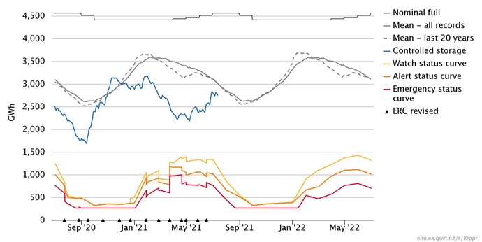
The data for the risk curves is available for download as a daily series via the data tab. This is a change from the previous report which only provided data on a change or at monthly resolution. The change brings all the data in the chart to daily resolution. For more information on the report see the more information tab.
Members can add this report to their own dashboard by hitting 'Add to my dashboard' at the bottom right, or 'Follow' the public dashboard to add this to their own dashboard menu.
Changes to the percentage risk curves over time are highlighted in several other public dashboards.
For more information on the electricity risk curves and the assumptions behind these see the system operator's website.


 .nz/sites/default/files/bulk-upload/documents/SOS101%20-%20Risk%20Meter.pdf


