Context is an important part of interpreting and understanding data. A comparison of recent observations to another time period or similar event in history allows insights to be drawn from the event or time period and the circumstances that existed at the time.
We’ve added a feature that lets users compare one period of time against another for the same data series. In addition to providing historical context, it also provides a great way to explore the data. The comparison feature is only enabled on selected EMI reports and allows time comparisons of one, seven, thirty, or ninety days, or a calendar quarter or year.
More information on how to use this feature.
Example time comparisons
- Increasing hydro risk curves (10% risk curve) 2015 - 2018
- Final pricing demand* over the last 4 weeks (try changing the region type and then selections in the series filter)
- Generation on Thursdays – 22 June to 20 July 2017 (try changing nodes in the series filter)
Example comparisons where the current measure will track against history, updating as new data becomes available
- Wholesale prices 2017 compared to 2012 and 2016 (try adding additional years)
- Total switches up in June on the last four years (try changing region or switch type)
- May 2017 demand up in Central North Island (try Upper South Island and the impact on NZ demand - you may want to zoom in)
- Changes in average PV capacity being installed by residential consumers
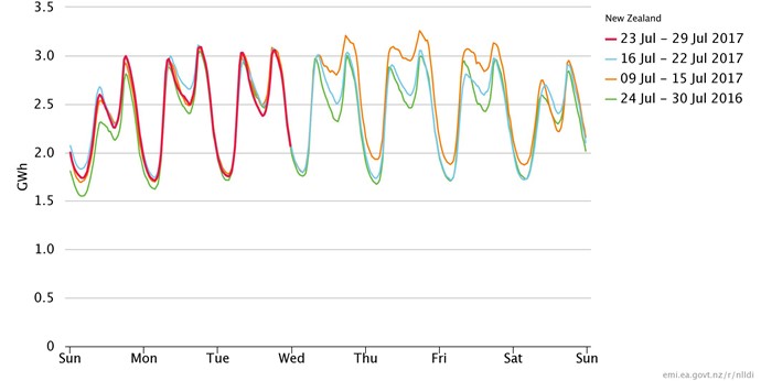
- Final pricing demand this week, last two weeks, and same week last year
Figure 1: Final pricing demand this week, last week, and same week last year

* The SPD model dispatches offered generation to meet ‘final pricing demand’ and set the wholesale price. Wind generation is not dispatched in the SPD model but modelled as negative demand. This means that final pricing demand presented here is usually less than total demand. Reconciled demand which accounts for all offtake from the grid and networks becomes available around the middle of each month for the previous month.

