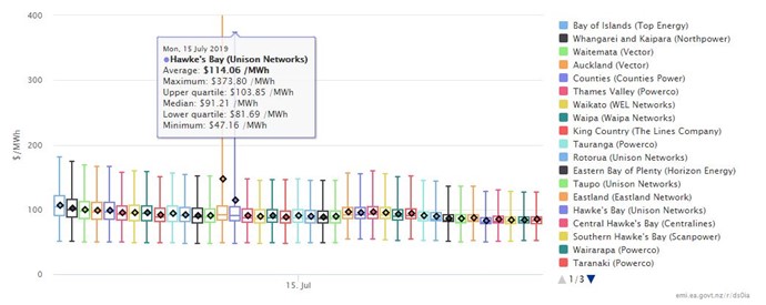
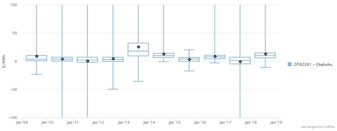
The wholesale price summary report presents a graphical summary of the distribution of wholesale prices using a box and whisker chart. The skew in the price distribution will be apparent when the average and median noticeably diverge.
This is a powerful report - allowing comparisons for different time durations (day, month, quarter, or year) between regions and through time for selected periods (eg the month of August 2008 - 2019). The report also allows users to summarise the difference in price from the selected nodes or region to a selected difference node. A couple of examples follow.
Wholesale price summary by network reporting regions, 15 July 2019

Otahuhu minus Benmore prices, the month of August, 2009 - 2018

Compare the price differences in the chart above to the Otahuhu minus Benmore August price differences from trade in the futures contracts.
Try clicking "All dashboard instances" at the top right of the report to see what instances have been added to user dashboards. It's a great way to quickly see what a report can do and the type of insights that can be derived.

